Political Logos: Power, Persuasion and Pitfalls
Political Logos: Power, Persuasion and Pitfalls
‘Tis the season of political messages. They are on every street corner and what seems like every minute of television commercial airtime.
Most political messages also include a political logo: a visual representation of the values, promises and energy the candidate will deliver if elected.
We asked some experts at Grady College what makes an impactful logo and the importance of a memorable logo in political contests. To narrow down the field, we discussed the two logos of the presidential candidates this year—the incumbent, President Donald Trump, and the challenger, Senator Joe Biden.
Those participating in the discussion were:
David Clementson, assistant professor of public relations. Before teaching, Clementson ran several successful political campaigns for Democrats and Republicans. He specializes in political communication research.
Kim Landrum, senior lecturer, advertising and public relations. Landrum teaches courses in graphic communication, messaging strategy and campaigns.
Kristen Smith, senior lecturer, advertising and public relations. Smith teaches courses in introductory and advanced graphic communication and public relations communication.
Joseph Watson, Jr., Carolyn Caudell Tieger Professor of Public Affairs Communication. Watson has more than 20 years of experience in public affairs, campaigns and communications, including serving as a legislative director and counsel for a former U.S. senator. Watson teaches courses about public affairs communications focused on public policy and politics.
John Weatherford, senior lecturer, New Media Institute. Weatherford teaches courses in digital product design and user experience.
Following are the general themes that were discussed.
Graphic Strength
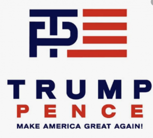
From a purely visual perspective, the two presidential logos are quite different. The Biden/Harris logo is straightforward and focused, giving almost equal weight to both names. My eye gravitates to the E which is styled like the stripes on the flag. The letters are kerned, or equally spaced, so the overall look is balanced. The Trump/Pence logo lacks the same visual punch due, in part, to the number of elements with two names, a tagline, the election year, star detailing and a stroke. Where does the eye go first? Placed together, the elements don’t have the same finesse as the Biden/Harris logo and the design lacks a visual focus point. The campaign logo for 2016 had significantly more flair with its integrated T&P but it did lack visual clarity and perhaps that is why it was abandoned. Neither logo is particularly inspired but if I had to pick a winner, the Biden/Harris logo is visually stronger. — Kim Landrum
The Trump/Pence logo for 2020 is fine, but it feels a little homemade. There is nothing daring or original in it. I would advise against putting a red box around the words and then adding some stars at the top because it seems rote. But the stranger thing, from a design perspective, is the vast amount of tracking—space between the letters in both men’s names. “Pence” especially looks like something you’d see in an eye exam. There is a message about importance being sent in the size of their names, too. Both names have five letters, but Trump dominates Pence in the logo. By comparison, the type in the Biden/Harris logo is justified—both words are in equal measure on the left and right and even though “Harris” has to be smaller than “Biden” because it has more letters, the names feel like a solid unit and give the impression of an equal team. There is nothing particularly clever or daring about the Biden/Harris logo, either, but that may be part of the point. It looks professional and stable, and the implication is that their ticket will be too. — Kristen Smith
I have always been struck by the absence of a flag or patriotic motif, aside from four small stars at the top in the Trump-Pence logo, but it is important to remember that the current Trump-Pence logo was adopted after an initial design was widely criticized and abandoned by the campaign. The typeface for both is solid as is the use of the red, white, and blue color palette, but the flag motif for the “e” in Biden makes it much more effective in my estimation. Aesthetically, the Trump-Pence logo is just not as attractive. — Joseph Watson, Jr.
The Message is King
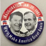
From having run successful political campaigns for Democrats and Republicans, I can tell you that I have never put any thought into the color scheme or shapes or font type or any other graphical elements of a candidate’s logo. The only thing that matters, which I learned long ago from one of Dick Morris’s books, is that there must be a message, not just the name and the office and the party. Voters need a reason to vote for you. So, in addition to—and more important than—the candidate’s name should be a slogan or mantra or motto. A succinct message is more effective. For example, Clinton/Gore materials said, “It’s time for a change.” Obama had “Change we can believe in” and “Yes, we can.” Trump took the motto to new heights with the prominent messaging of “Make America great again,” which was also used by Reagan in 1980, Bill Clinton in 1992, and Hillary Clinton in 2008. A logo is worthless without a message giving voters a reason to vote for you. — David Clementson
Comparing the logos isn’t totally fair because the Biden/Harris logo doesn’t have their slogan, “Battle for the soul of the nation” on it. Actually, is that their slogan? It’s at the top of their website. It brings up associations for me with the Battle of Hogwarts—maybe people have other battles that come to mind but the phrase is heavy with struggle and myth and even morality. The Trump/Pence slogan, “Keep America Great” is hard sell this year no matter who you support for president. — Kristen Smith
The Logo Doesn’t Really Matter
Based on the most rigorous and extensive evidence across the social sciences that has been conducted testing on voters’ reactions to electoral campaign stimuli, we can predict undoubtedly that Democrats like the Biden logo and dislike the Trump logo, and Republicans like the Trump logo and dislike the Biden logo. If the color schemes and styles and fonts were altered, their vote choices wouldn’t change. Voters’ likes and dislikes are driven by partisanship and inconsistent attitudes, beliefs, and opinions follow. — David Clementson
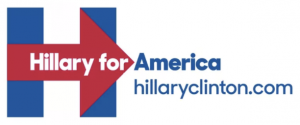
Logos in and of themselves really do not impact electoral outcomes. But bad logos that do not reflect a campaign’s brand and serve its objectives and messaging are often indicative of a campaign that is not well executed. Ultimately, you want to select a logo that does no harm to a campaign and does not generate negative coverage or become a story itself as was the case with logos for the Jeb! 2016 campaign, the initial Trump-Pence 2016 logo and the Hillary 2016 logos. Boring is better than a logo that draws negative attention or has to be withdrawn. — Joseph Watson, Jr.
These logos are both perfectly fine and uninteresting as pieces of design. I care about good design as much as nearly anyone, and yet I couldn’t possibly care less about these logos. I find it hard to believe that a single vote will be influenced one way or the other by either logo. — John Weatherford
Hidden Messages
The fact that the Trump name in the Trump-Pence logo leaves no doubt that this is not a partnership between president and vice-president whereas the closeness in font size between Biden and Harris and the use of the same color in the Biden-Harris logo conveys more parity between the two with the flag motif re-enforcing that Biden is the top of the ticket. — Joseph Watson, Jr.
More Graphics Background (Bonus)
The typeface designer for Decimal, the type used in the Biden/Harris logo, is Jonathan Hoefler along with his team. Hoefler was inspired by vintage watches when he created this typeface. The Obama campaigns used typefaces by Hoefler & Co., also. The Biden/Harris campaign will not stray from whatever style guides have been determined by their design team because that’s what style guides are for—to maintain consistency. By the way, if you haven’t seen the Netflix show Abstract that features him, you should check it out! — Kristen Smith